The 100 neighborhoods with the highest incomes in the United States have similar racial make-up as the Higley 1000. There is a slightly higher percentage of Non-Hispanic Whites (91.4%) and significantly fewer Asian-Americans and African-Americans than in the larger list. Hispanics were better represented primarily on the strength of five Miami neighborhoods with high Cuban populations. The five Miami neighborhoods contribute 38.4% of Latinos in the Elite 100. There were a total of 51,844 households found in all Elite 100 neighborhoods.
Asian-Americans are still over-represented in the Elite 100 with 4.3% of the households versus 2.7% of the total households in the United States. Although African-Americans makeup only 1.0 % of the Higley 1000 households, they contribute significantly fewer households (.7%) to the Elite 100. As I have questioned repeatedly on my site, where are the wealthy Black households? They made up 11.7% of all American households in the 2000
and 4.4% of the households making over $200,000, yet there representation in the best neighborhoods is negligible.
The Elite 100 is surprisingly diverse in terms of the number of metro areas represented on the list. No less than 27 Metro areas have their “best” neighborhoods on the list, although many of them (13) only have one place. As in the list of 1000 neighborhoods, the New York City metro area dominates the Elite 100 with 30 neighborhoods or small villages. There are 17 in the state of New York, 7 in Connecticut, and 6 in New Jersey for a total of 30% of the Elite 100. The Los Angeles metro area is a distant second with 11 neighborhoods on the list, followed by Chicago with nine.
When defining the type of neighborhoods that make up the Elite 100, it is best to think of a continuum as some neighborhoods are difficult to assess on a national scale. As an example what is “traditional” or “nouveau riche” in Florida? With some equivocation I have adjudged that 65 of the 100 as “traditional” and 30 as “nouveau riche“. The remaining five are hard to catagorize oceanfront Florida neighborhoods (Jupiter Island, Johns Island, the Everglades Club of Palm Beach, Lost Tree Village-Seminole Landing, and Ponte Vedra Beach).
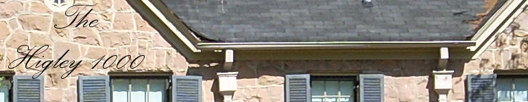
There are 15 neighborhoods found in the corporate limits of central cities, however, only Midtown Manhattan could truly be considered urban.
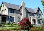
The richest neighborhood in the United States is the lush Holmby Hills neighborhood just west of the Los Angeles Country Club in the so-called Platinum Triangle (along with Beverly Hills and Bel Air). This small neighborhoods has some of the most gargantuan houses in the United States including Candy Spelling’s 60,000 square foot mansion.
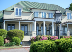
The second richest neighborhood in the United States is located in Denver’s Cherry Hills Village. I have named this collection of upscale sub-divisions Buell Mansion-Cherry Hills Park after two of this Block Group’s most luxurious developments. Cherry Hills Village is typical of the Western United States in that it is hard to categorize. It is a combination of old wealth and the uber-mansions of the nouveau riche.